
9 Best Color Palettes for
Cleaning Service Websites in 2024 (+ Examples)
By Kristie Parker
Your cleaning service website needs to connect with your visitor immediately. Think of your website colors as the curb appeal of your home. They should attract visitors, not turn them away.
The colors on your website are the mood-makers, the first hellos, they help paint a vivid picture of who you are as a business.
Colors That Make Cleaning Service Websites Sparkle
Get inspired by cleaning service websites that really understand the assignment.
From chic minimalist tones to bold statement hues, we’ll show you nine websites that aren’t just clean – they’re fresh and inviting.
Full disclosure – two of them happen to be designs from our own portfolio. So in no particular order, here are 9 of our favorite cleaning service website color palettes that are cleaning up online.
And if you’re looking for even more simple, free ways to pump up the volume on your website check out this post.
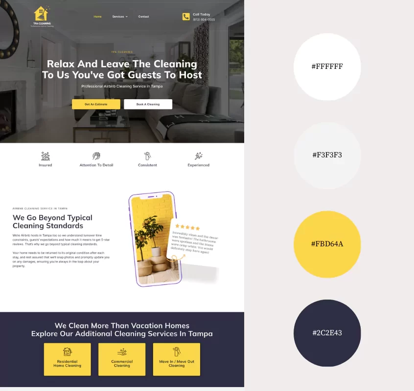
Why We Like This Color Palette:
TPA Cleaning’s website color palette strikes a perfect balance between cleanliness, vibrancy, and trustworthiness. The dominant whites reflect the core value of cleanliness, making the site feel spotless and organized.
The yellow adds a dash of energy and positivity, perfect for highlighting important sections and creating an inviting, dynamic environment. While the navy blue provides a touch of professionalism and reliability, reassuring visitors of TPA Cleaning’s expertise.
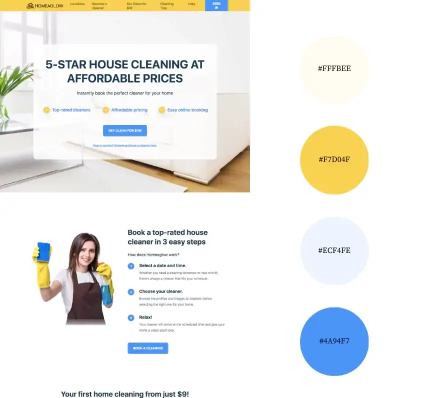
Why We Like This Color Palette:
Homeaglow’s palette combines warm cream (#FFFBEE), bright gold (#F7D04F), and playful blues (#ECF4FE and #4A94F7) for a cheery, upbeat vibe. The cream offers a clean backdrop, while the gold infuses affordable luxury. The blues add a sense of trust and efficiency, harmonizing together to create a welcoming, optimistic atmosphere that reflects Homeaglow’s friendly and reliable cleaning services.
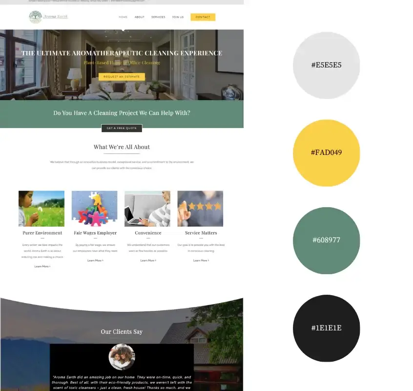
Why We Like This Color Palette:
Aroma Earth’s color palette is a cool blend of earthy and bright tones. The light grey and deep black provide a modern, clean foundation, setting the stage for the pops of sunny yellow and earthy green.
This combo feels super refreshing and totally in tune with their eco-friendly vibe. The yellow adds a splash of cheerfulness, while the green keeps things grounded and natural. It’s a laid-back yet professional look that perfectly captures Aroma Earth’s spirit of environmentally conscious cleaning.
You’re looking for a color palette.
But that’s not really why you’re here.
You notice details. You want design elements that look intentional, even if you’ve got zero design skills whatsoever. That’s where we come in. We’ll give your website the visual appeal it needs to attract real people AND Google.
Contact us today to talk about your new website design.
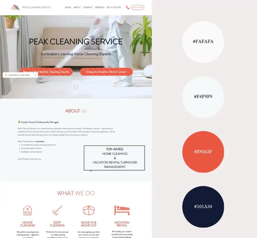
Why We Like This Color Palette:
Peak Cleaning Service’s palette is impactful. The whites are fresh, clean, and make the site feel spacious and spotless. Then you’ve got that punchy orange adding a vibrant, energetic kick. The navy brings in some professionalism, making everything look more grounded and trustworthy. This combo is spot-on for showing off their top-notch cleaning and turnover management services. It’s clean, it’s bold, and says ‘we mean business.’
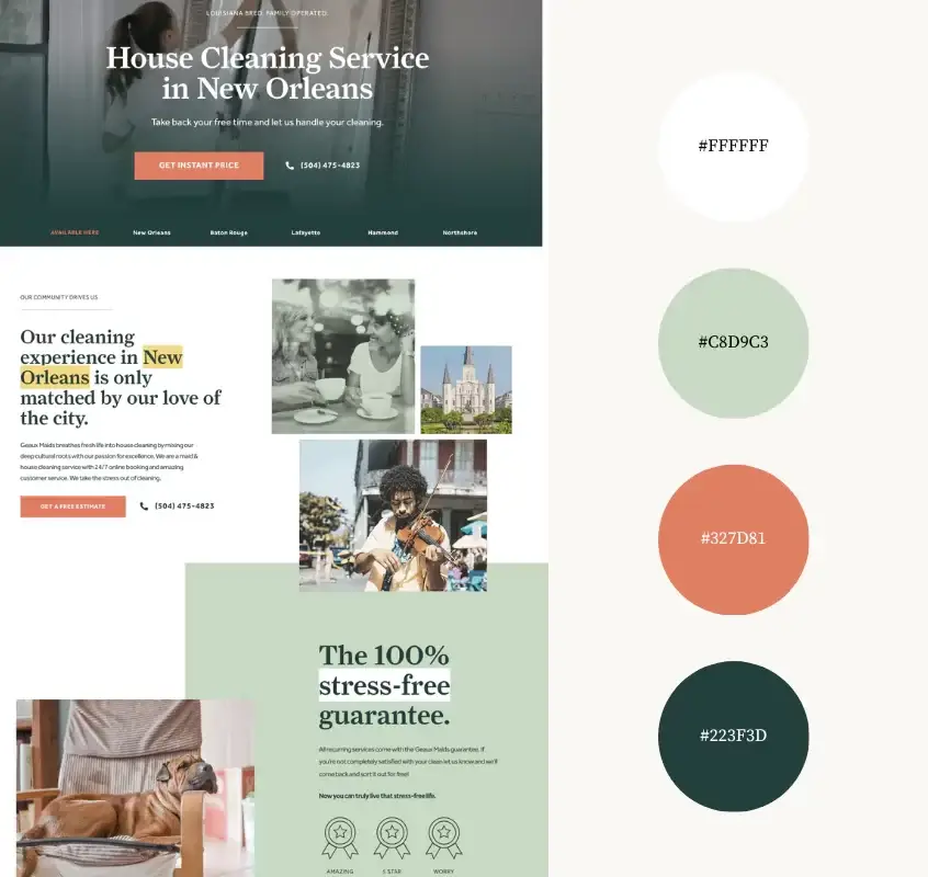
Why We Like This Color Palette:
Sage brings in a touch of calmness and nature, perfect for creating a relaxing, but eye-catching vibe. The deeper green adds a sense of depth and luxury and connects to nature. It plays nicely against the crisp white. This blend of colors feels fresh, calming, and totally in sync with their whole ‘stress-free cleaning’ promise. It’s modern, cool and a bit earthy.
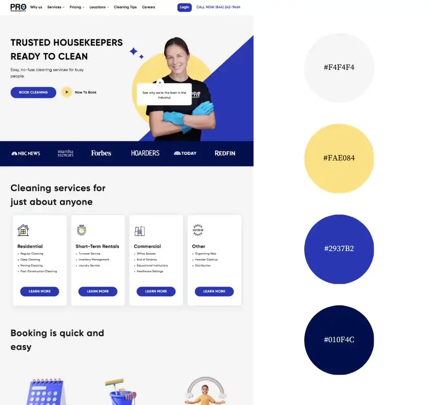
Why We Like This Color Palette:
Pro Housekeepers’ palette is a modern mix of light grey and sunny yellow, accented by sophisticated deep purples. This combo is inviting yet professional. The grey and yellow give off an easy-going vibe. The blues add that touch of class and reliability. The site’s aesthetic is like Uber for cleaning – fresh, straightforward, and cool. The color scheme, combined with the clean layout and straightforward fonts screams modern efficiency, just what you need for hassle-free housekeeping.
Tara’s Professional Cleaning Service
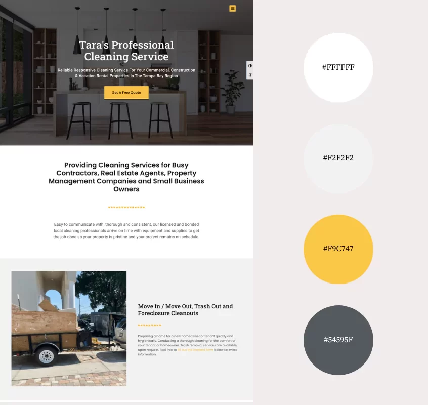
Why We Like This Palette:
Tara’s Professional Cleaning Service goes for a classic and clean look with whites and light grey, spiced up with marigold and a cool dark grey. The marigold touches add a spark of energy and friendliness, making the site feel welcoming and approachable.
This color scheme is straightforward and effective, just like the service they provide. It’s a no-nonsense, clean, and professional vibe that perfectly matches the owner’s vision for a one-page, easy-to-navigate website. This palette says, “We’re efficient, we’re dependable, and we’ll make your space shine.”
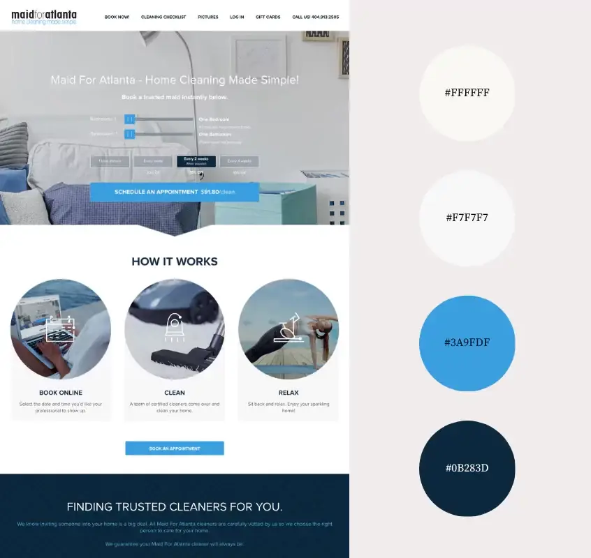
Why We Like This Palette:
Maid for Atlanta nails it with a sleek combo of whites, light grey, and a striking blue duo. The whites and light grey set the stage for a clean, clutter-free look, echoing the simplicity and ease of their service. It’s like the site is saying, “We’re all about making your life easier.”
Then, those blues – a bright sky blue and a deeper navy – add a splash of energy and trustworthiness.
This palette is perfect for a modern cleaning service. It’s clean, it’s fresh, and it’s got just the right amount of pop to keep the call to action buttons striking.
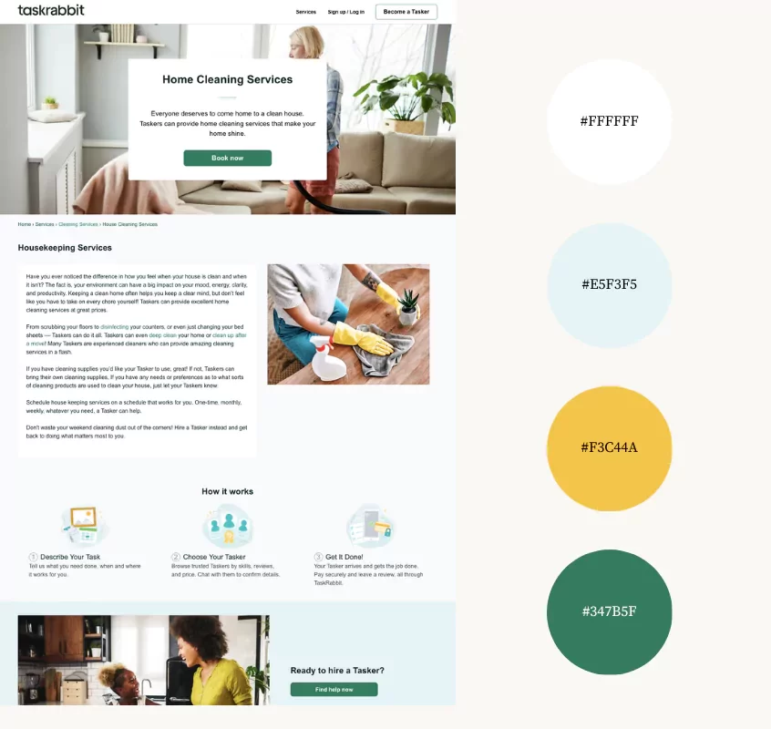
Why We Like This Palette:
Task Rabbit’s palette is a fresh mix that perfectly matches their vibe. The soft aqua (#E5F3F5) and crisp white (#FFFFFF) create a backdrop that’s clean and calming. These colors make the site feel open and airy.
The sunny yellow adds a warm, friendly touch. This color scheme is inviting, reassuring, and in line with their mission to help you find the best cleaning help with just a few clicks.
Psst! Found a color you love but unsure of its hex code? Here’s how to easily capture hex codes from any website.
Choose A Cleaning Service Website Color Palette That Makes A Statement
From the trust-inducing blues to the energizing bursts of yellow, each of the palettes above does more than just look pretty; they communicate the personality of the business.
Soothing greens evoke thoughts of eco-friendliness and renewal, while crisp whites echo the pristine result of your cleaning service’s hard work.
As you consider the color scheme for your cleaning service website, remember that each shade you choose has a role to play in shaping perceptions and influencing emotions.
Want to see more website color palette inspiration? Check out 9 Best Color Palettes for Accountant Websites, 7 Best Color Palettes for Therapy Websites and 9 Best Color Palettes for Travel Websites.

Kristie Parker
Kristie is the co-owner of Bungalow Web Design. She pretends to be a real adult by writing copy for small business websites from her actual bungalow in Tampa, Florida. When she's not web designing, you can find her in the gym, air frying something, or tucking into a Joyce Carol Oates novel with a dirty martini and orange cat nearby.