
7 Best Color Palettes for Therapy Websites
in 2023 (+ Examples)
By Kristie Parker
Your website is an extension of your therapeutic space. The colors you use? They’re not just there to look pretty. They’re evoking emotion in your website visitors, shaping their feelings about your brand, even before they read a single word.
Therapy Websites Use Color Psychology To Evoke Emotion
This is the incredible power of color psychology. A calming blue or a grounding earth tone can speak volumes, fostering feelings of trust, stability, and incorporating accent colors can highlight important areas, guiding the visitors’ journey throughout your therapy website.
So, while we all love a good aesthetic, choosing a color palette for your therapy website is so much more than just picking out your favorite shades. It’s about creating an atmosphere, aligning with your brand, and most importantly, meeting the emotional needs and expectations of your audience.
In this blog post, we’re going to highlight seven websites that absolutely nailed it with their color choices. Full disclosure – a few of them happen to be designs from yours truly. So in no particular order, here are 7 of our favorite therapy website color palettes.
Psst! Found a color you love but unsure of its hex code? Discover how to easily capture hex codes from any website with this super simple tool.

Why We Like This Color Palette:
The neutrals give visitors the sense of an online sanctuary where visitors feel comfortable enough to explore and engage with the therapeutic process. The neutrals pair beautifully with an inviting soft green and the punch of orange is the perfect accent color to make the buttons stand out and give the website a friendly feel.

Why We Like This Color Palette:
Here We Go Therapy focuses on progressive therapy and their website definitely makes you feel like they’re a modern counseling business. Their colors are trendy with popular shades of teal and violet which perfectly match the personalities of the young approachable therapists.
You’re looking for a color palette.
But that’s not really why you’re here.
You notice details. You want design elements that look intentional, even if you’ve got zero design skills whatsoever. That’s where we come in. We’ll give your website the visual appeal it needs to attract real people AND Google.
Contact us today to talk about your new website design.
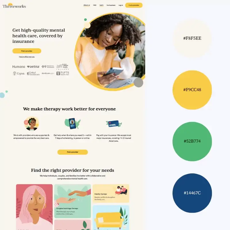
Why We Like This Color Palette:
Bright, warm colors like yellow radiate positivity and energy and that’s exactly what Thriveworks is serving us. Their bold tones are playful and so is the language on their website. Less buttoned up and more welcoming to website visitors who may be brand new to therapy.

Why We Like This Color Palette:
The expert behind Compass Psychological Services is a licensed clinical psychologist specializing in therapy for professionals. Her color palette exudes luxury, sophistication and prestige that validates her high end offerings. The tones are cool, appealing to clients searching for calm and peace.
Want to see more examples of our website designs? Check out our portfolio.
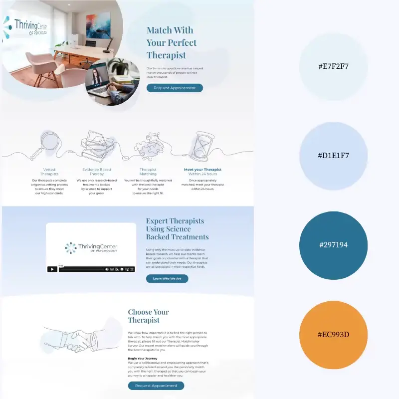
Why We Like This Color Palette:
The Thriving Center of Psychology understands the power of the color blue. Promoting serenity and trust they do a beautiful job of weaving together the shades of blue while also drawing attention to their call-to-action buttons in throwback orange so it’s clear that website visitors should request an appointment.

Why We Like This Color Palette:
Soft, dreamy and inviting to teens and young adults, Balance Counseling & Wellness knows her audience. The colors are fresh and warm but pastel enough to give this site a touch of femininity. Green is woven through the entire homepage providing a sense of nature and evoking feelings of wellness and therapeutic healing.

Why We Like This Palette:
Modern and inclusive, myTherapyNYC uses colors that feel cozy. The soft pink complements the dark teal perfectly for a relaxed vibe. We often see this pairing for wedding color palettes which makes sense given that this counseling service specializes in relationships.
Use Color to Turn Therapy Websites Into Client Magnets
Those are our 7 favorite color palettes for therapy websites because they build trust, highlight the brand’s identity and meet clients where they are, emotionally.
We hope these examples inspire you to think about your website colors in a new way so you can welcome your visitors into your therapeutic space before they even enter your office.
Want to see more color palette inspiration? Check out 9 Best Color Palettes for IT Services Websites, 9 Best Color Palettes for Accountant Websites, 7 Best Color Palettes for Cleaning Service Websites and 9 Best Color Palettes for Travel Websites.