

Best Color Palettes For Accountant Websites In 2024 (+ Examples)
By Kristie Parker
Choosing the right color palette for your accountant website isn’t just about aesthetics. It’s about solving the deep, common problem your audience faces: the overwhelming complexity of financial management.
Essential Features Customers Look For in Accountant Websites
Your clients are seeking not only tax expertise but also trust, clarity, and capability.
For someone already navigating the complexities of taxes, retirement plans like 401(k)s, or investment portfolios, encountering a disorganized or impersonal website adds to their anxiety.
If your website looks more like a kid’s art project than a professional accountant’s site, you’ll drive them away.
Without a cohesive color scheme, your website visitors wonder if you can sort out their finances when you can’t even organize your own website.
Convey Trust Through Your Website Color Scheme
The right colors can communicate these values at a glance, offering a deep emotional reassurance that they’ve come to the right place.
Check out our top 9 examples of accountant websites from across the industry that tap into color psychology.
Psst! Found a color you love but unsure of its hex code? Here’s how to easily capture hex codes from any website.
Content of this page
9 Top Design Examples for Accountant Websites

Why This Color Palette Works:
Blu Jax Accounting’s website is one of our small business website designs! We used a red, white, and blue palette that evokes trustworthiness and professionalism. The red adds a vibrant accent, highlighting important features and calls to action. Blue, traditionally associated with trust and stability, reinforces the firm’s reliability.
The clean white background ensures the site remains uncluttered and focused. This color scheme cleverly balances professionalism with a welcoming tone.
Payroll Data Processing

Why This Color Palette Works:
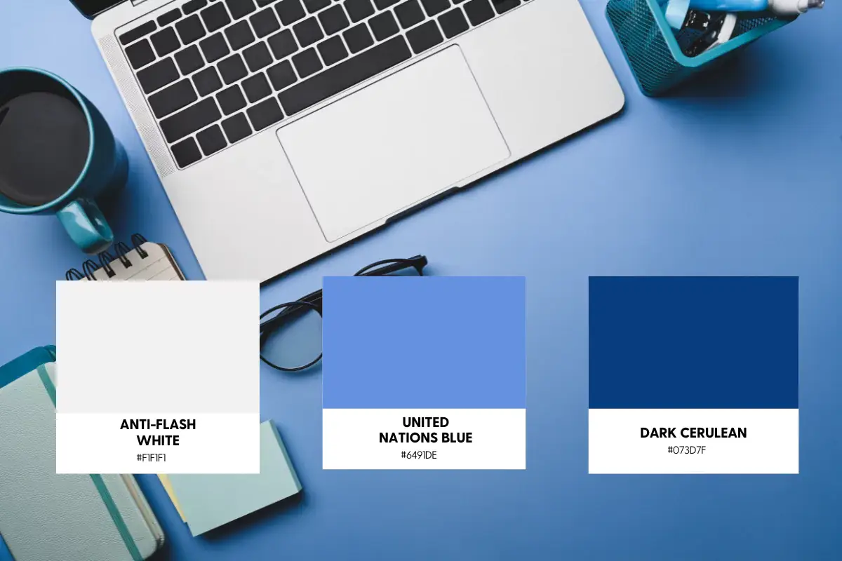
Payroll Data Processing’s website uses a palette that perfectly marries professional trust with clarity. The strategic use of blues conveys a deep sense of reliability and trust Against the crisp white background, these blues stand out, guiding the user’s eye to key information and actions. This color scheme is both reassuring and authoritative, appealing to businesses looking for dependable payroll solutions.

Why This Color Palette Works:
A sophisticated and inviting color scheme that speaks to the professional and positive nature of their staffing services. The combination of a soft, almost white background with light blue offers a refreshing and clean look, while the bold red accentuates important actions and areas, bringing an energetic contrast. The deep navy adds a layer of seriousness and professionalism, perfectly aligning with the firm’s reputation in the recruitment industry. This palette manages to be both welcoming and authoritative.
You’re looking for a color palette.
But that’s not really why you’re here.
You notice details. You want design elements that look intentional, even if you’ve got zero design skills whatsoever. That’s where we come in. We’ll give your website the visual appeal it needs to attract real people AND Google.
Contact us today to talk about your new website design.

Why This Color Palette Works:
Collective’s website is a breath of fresh air, featuring soft neutrals with a pop of warm pink and a confident red. It creates an inviting and supportive atmosphere.
This palette communicates warmth, approachability, and a hint of innovation, aligning perfectly with Collective’s mission to simplify the complexities of business finance.

Why This Color Palette Works:
Dark Horse’s website combines a sophisticated mix of cream, light blue, vibrant orange, and deep navy. This palette suggests both reliability and a fresh perspective. The orange adds a dynamic pop, while the navy grounds the design, assuring users of their professionalism. This color scheme effectively communicates their commitment to providing clear, actionable financial insights.

Why This Color Palette Works:
Nimbl’s website uses a fresh, clean palette that signals innovation. The crisp white and soft grays set a sleek, minimalist backdrop, while the vivid green is a modern spin.
Black is used to anchor and emphasize, ensuring that critical information stands out. This palette effectively communicates Nimbl’s approach to providing user-friendly, accessible financial help.
Crowe

Why This Color Palette Works:
Crowe’s website palette reflects its commitment to blending traditional with modern. The gold and blues—from sky to navy—impart a sense of optimism, clarity, and depth. This combination positions Crowe as a forward-thinking firm that appeals to fast-paced businesses looking to grow. The use of gold highlights their commitment to excellence and the deep blues convey trust and reliability.

Why This Color Palette Works:
This firm’s future-focused accounting services website blends modernity with warmth, thanks to its use of a vibrant orange against a backdrop of white and dark gray, accented with soft blue.
The orange is energetic, highlighting their proactive approach to financial management, while the softer shades ensure the site feels welcoming and accessible.

Why This Color Palette Works:
BELAY’s palette of fresh green and deep navy against a clean background intuitively signals a blend of innovation and steadfast reliability. This choice speaks directly to entrepreneurs and business leaders seeking not just accounting solutions, but a partnership that promises growth and stability.
The green hints at the fresh, modern approach BELAY takes in empowering clients, while the navy assures professionalism.
These 9 Accountant Websites Make a Professional First Impression
Choosing the right color palette for your accounting website goes beyond, “I like yellow.”
It’s a strategic move to simplify financial complexity for your clients, offering them peace of mind and a sense that you are the one they’re looking for.
By selecting cohesive and appropriate colors, you signal trust, clarity, and professionalism, reassuring visitors they’re in capable hands.
For more color inspiration, check out our posts on color palettes for IT services, cleaning services, travel, and therapy websites.

Kristie Parker
Kristie is the co-owner of Bungalow Web Design. She pretends to be a real adult by writing copy for small business websites from her actual bungalow in Tampa, Florida. When she's not web designing, you can find her in the gym, air frying something, or tucking into a Joyce Carol Oates novel with a dirty martini and orange cat nearby.