
9 Best Color Palettes For Travel Websites
in 2023 (+ Examples)
By Kristie Parker
9 Travel Websites with Stellar Color Schemes
We’ve compiled a list of 9 travel agency websites that brilliantly use color to match their brand and make their content pop. We even included one from our own portfolio.
All of the examples include hex codes so you can use them as inspiration for your own website.
Why We Like This Color Palette:
The standout orange brings a burst of energy, which fits perfectly with the brand’s spontaneous vibe. The clean white offers a fresh, open feel. The calming mint green paired with the deeper green balances things out, giving a sense of diverse landscapes and well-rounded adventures. All in all, it’s fun and adventurous, but still feels grounded – matching the brand perfectly.
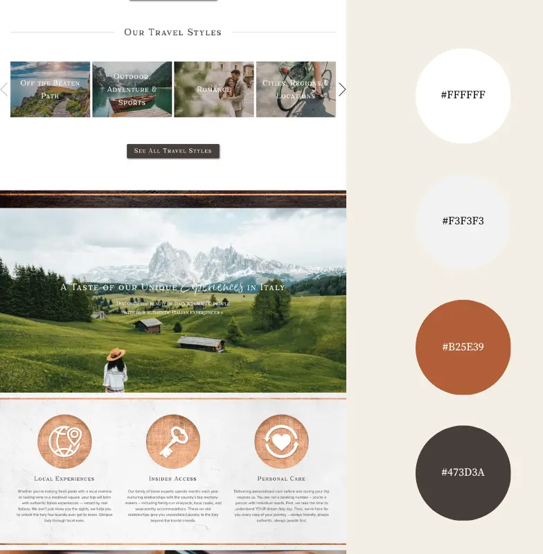
Why We Like This Color Palette:
The warm terracotta shade is instantly evocative of Italy’s rustic charm and sun-baked streets, pulling you into memories of quaint towns and Tuscan sunsets. The soft greys serve as a neutral backdrop, allowing that beautiful rustic color to truly shine. Then there’s the rich, earthy brown, which feels like a nod to Italy’s deep-rooted history. Combined with the clean white, it feels like a well-curated photo album – some highlights, some understated moments, but all undeniably Italian.
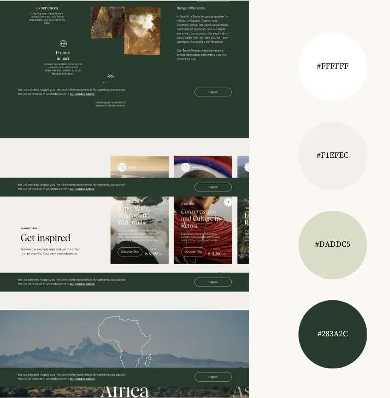
Why We Like This Color Palette:
The primary olive green immediately connects with the essence of exploration and nature, perfectly aligning with the adventurous spirit of the brand. The softer shades of cream and muted beige evoke a sense of calm and sophistication. Paired with the deep forest green, it gives a rich, earthy feel, which speaks to Niarra’s commitment to impactful and meaningful travel. With a foundation of clean white, the palette collectively feels purposeful and fresh, mirroring the brand’s travel experiences.
You’re looking for a color palette.
But that’s not really why you’re here.
You notice details. You want design elements that look intentional, even if you’ve got zero design skills whatsoever. That’s where we come in. We’ll give your website the visual appeal it needs to attract real people AND Google.
Contact us today to talk about your new website design.
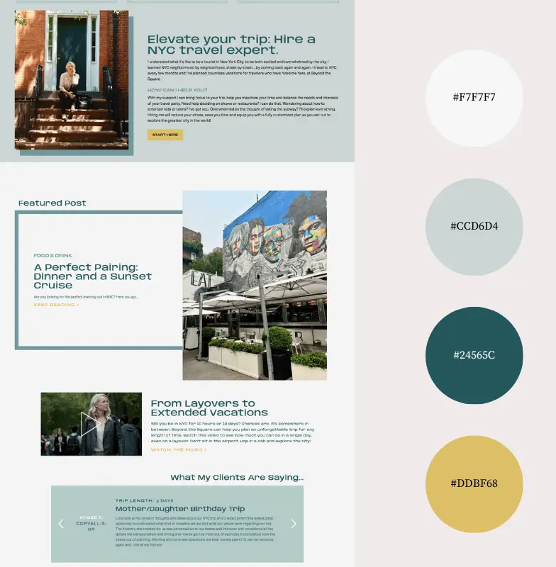
Why We Like This Color Palette:
The modern teal stands out, reflecting the contemporary pulse of NYC while nodding to this year’s popular color trend. Paired with a sophisticated gold, it infuses the palette with a touch of luxury, echoing the high-end experiences the city offers. The soft greys provide a calm backdrop. Together, these colors combine the urban sophistication of New York with the contemporary flair that draws travelers to the city.
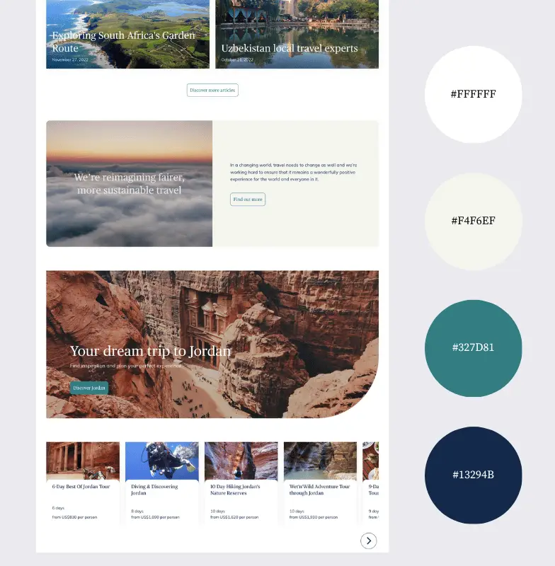
Why We Like This Color Palette:
The standout teal resonates with the idea of fresh adventures and new horizons, aligning with the brand’s emphasis on authentic experiences. The deep navy adds depth and trust, emphasizing the reliability of the local experts.
The soft, near-white hue offers a neutral background, allowing the bolder colors to pop. All together, these shades capture the essence of connecting with genuine, on-the-ground expertise while embarking on global travels.
Why We Like This Color Palette:
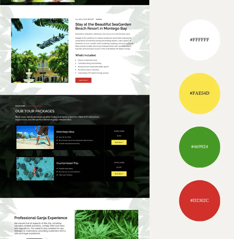
The vibrant yellow, reminiscent of Jamaica’s sun-soaked beaches, partners well with the deep green, channeling the island’s lush landscapes and rich cannabis culture. The striking red injects energy, echoing the vibrant music scene.
Together, these colors not only capture the essence of the all-inclusive cannabis vacation tours but also subtly nod to the iconic Jamaican flag, grounding the brand in its roots. The palette perfectly balances relaxation, cultural immersion, and the unique ganja-themed experiences that 420jamaicatours promises.
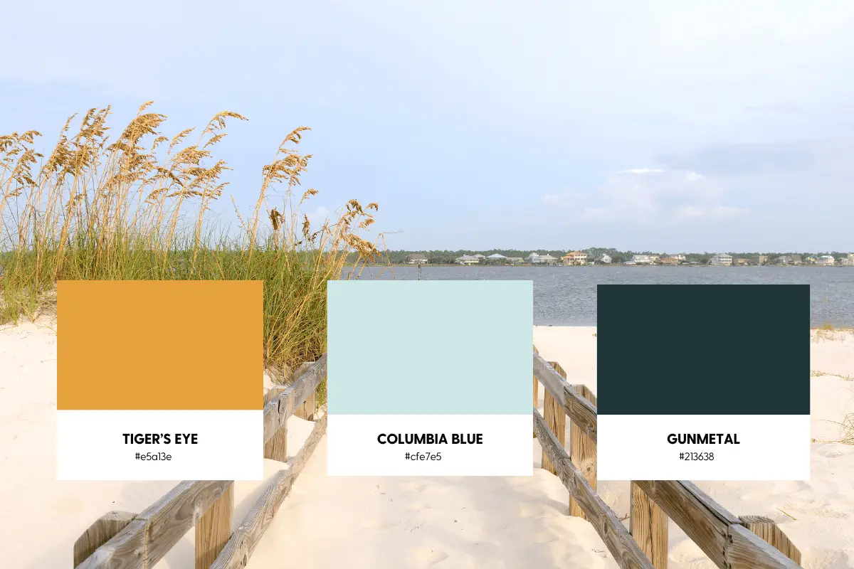
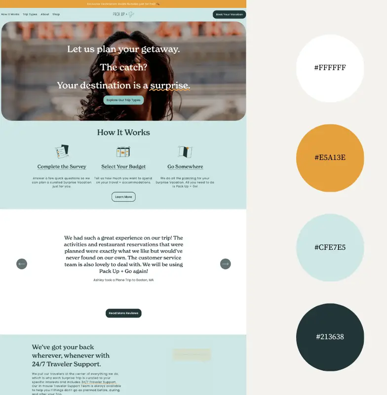
This is actually one of our own designs. We created it for an amazing local travel agent. We’d love to design a visually appealing, client attracting website for you too, find out more about how to work with us.
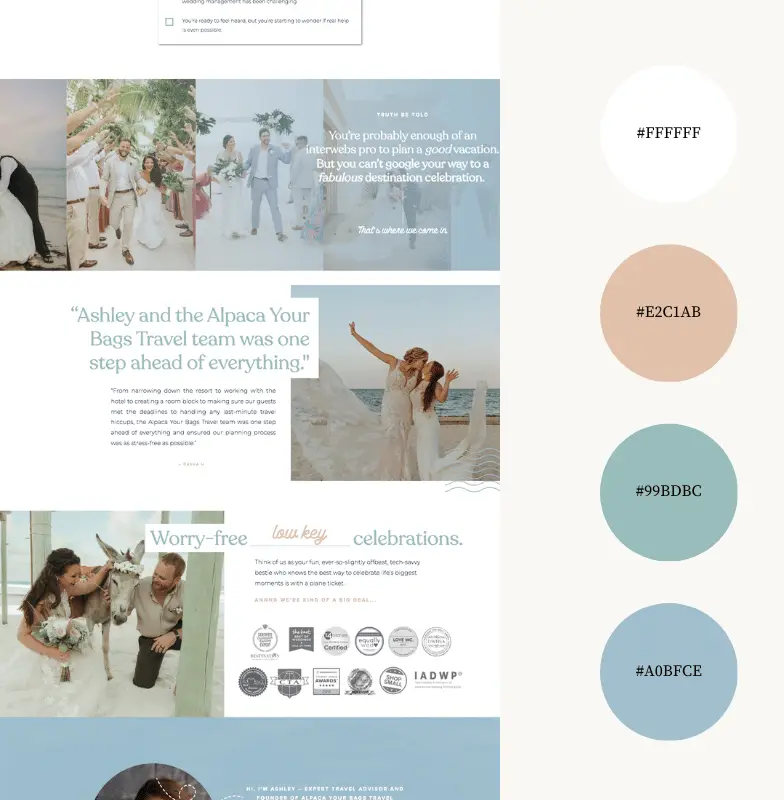
Why We Like This Palette:
The soft blush pink immediately resonates with romance, perfect for those looking to plan weddings and honeymoons. The different shades of muted blue convey intimate tropical beach intimate getaways. The clean white backdrop provides breathing space, much like the company’s approach to stress-free wedding planning.
Overall, the palette feels romantic yet clear-cut, aligning perfectly with the brand’s specialty in crafting memorable wedding and honeymoon experiences without the fuss.
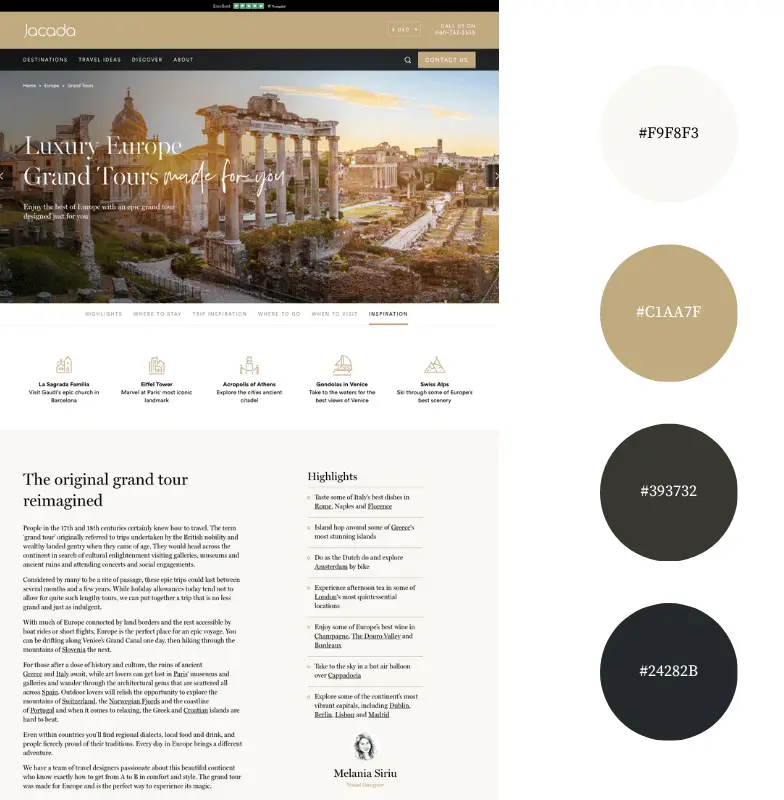
Why We Like This Palette:
The sophisticated gold hue speaks directly to luxury, giving an immediate sense of premium, bespoke travel experiences. The dark, grounding greys and blacks resonate with the brand’s depth and vast offerings, from Polar Regions to the South Pacific.
The light neutral provides a serene base, aligning with the travel agency’s commitment to responsible travel. Together, this palette perfectly balances luxury with responsibility, showcasing Jacada’s unique approach to travel.
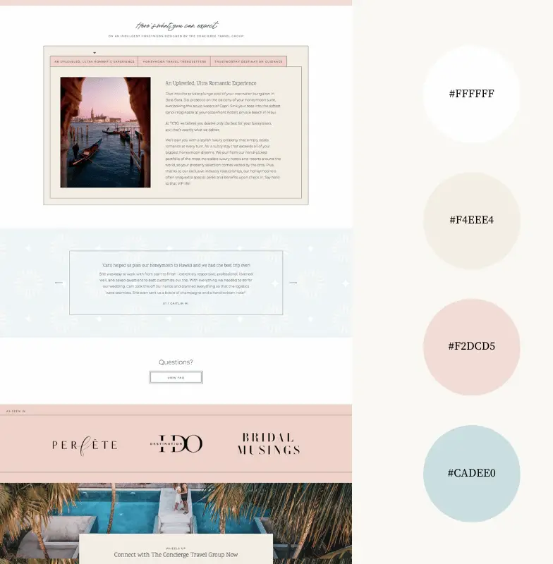
Why We Like This Palette:
The soft peach and blush tones scream romance and luxury, fitting for couples looking for that dreamy honeymoon getaway. The subtle aqua blue reminds us of pristine waters and tropical escapes, aligning perfectly with the luxurious overwater bungalows and beachfront stays mentioned. Altogether, the palette feels dreamy and upscale, encapsulating the promise of an unforgettable honeymoon journey.
The Impact of Color Choices on Travel Websites
After diving into these 9 travel agencies, we’ve seen how each palette, with its careful blend of neutrals and standout shades, can set the tone for a user’s experience.
Who doesn’t get honeymoon feels from Caribbean beach colors or get lost in the opulence of a luxury European vacation? Colors help get your website visitors excited for a trip before they’ve even packed their bags.
Want to see more color palette inspiration? Check out 7 Best Color Palettes for Therapy Websites in 2023 (+ Examples), 9 Best Color Palettes for Accountant Websites, and 9 Best Color Palettes for Cleaning Service Websites.

Kristie Parker
Kristie is the co-owner of Bungalow Web Design. She pretends to be a real adult by writing copy for small business websites from her actual bungalow in Tampa, Florida. When she's not web designing, you can find her in the gym, air frying something, or tucking into a Joyce Carol Oates novel with a dirty martini and orange cat nearby.