
9 Best Color Palettes for IT Services Websites in 2025 (+ Examples)
- By Kristie Parker
- July 9, 2025
Tech brands don’t need to look boring.
But a lot of them do.
IT companies often defer to grays on grays and stark white website colors because they want to look dependable and professional, but they end up erasing all personality.
Let’s fix that.
A cohesive color palette can make you look credible, established, and worth taking seriously. Definitely something you want when you’re in the IT business where clients are handing over sensitive data or big decisions.
9 IT Services Websites With Stellar Color Schemes
We included examples of cybersecurity firms, data consultants, and managed IT providers. Each example shows how intentional color choices can shift perception from cold corporate to confident.
Bonus! Each one includes hex codes you can swipe for your own site.
Content of this page

Why We Like This Color Palette:
The bold orange paired with true blue makes the site feel fresh, modern, and welcoming.
The colors are used with intention in icons, buttons, and subtle details, balanced by plenty of white space. That restraint keeps the site feeling clear and approachable. These colors are a perfect fit for a brand that’s dependable, easy to work with, and focused on positive customer experiences.
Why We Like This Color Palette:
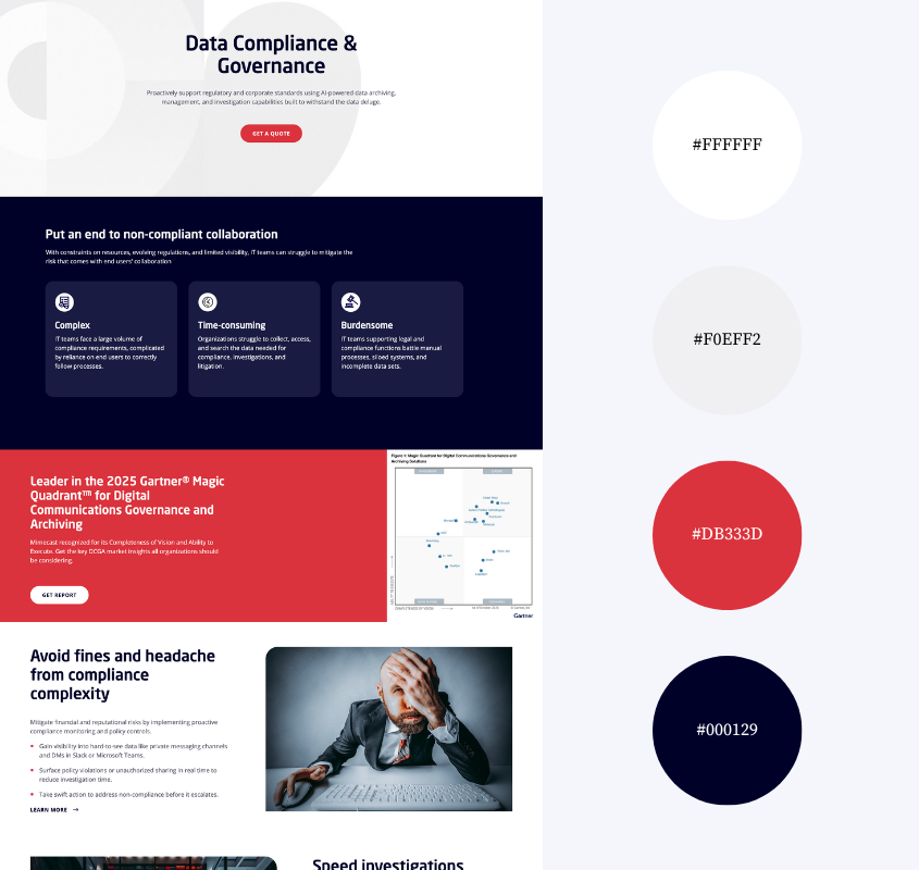
Mimecast’s palette feels authoritative and polished which is exactly what you want from a security-led email provider. The deep navy grounds the brand with authority, while scarlet red brings bold emphasis to call-to-action buttons. Plenty of soft gray and white space keeps the layout clean, clear, and easy to navigate.
Why We Like This Color Palette:
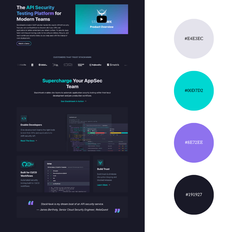
StackHawk’s palette leans into a modern dark mode aesthetic with a deep navy background that sets the tone. Bright teal and soft violet pop against the darkness, giving the site energy.
Lavender-gray text adds contrast without straining the eye with stark white. It’s a confident, intentional look that feels right at home in a developer’s world.
You’re looking for a color palette.
But that’s not really why you’re here.
You want a website that looks professional, even if you’ve got zero design skills. That’s where we come in.
Why We Like This Color Palette:
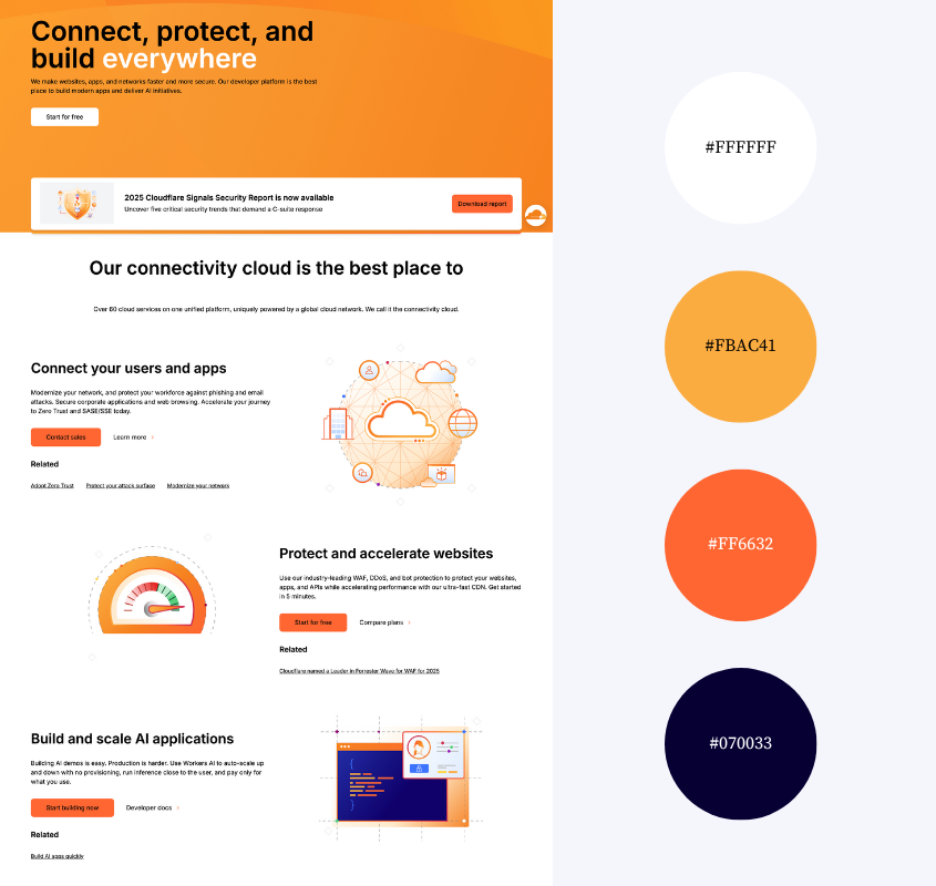
Cloudflare uses orange in a way that feels bold but playful. It shows up in gradients across headline text, giving the site a warm, energetic feel without overwhelming the layout. Paired with light neutral backgrounds and deep blue fonts, the orange becomes a focal point.
Illustrations and icons in the same palette, create a cohesive and well-paced visual flow. It feels modern, polished, and full of warm personality.
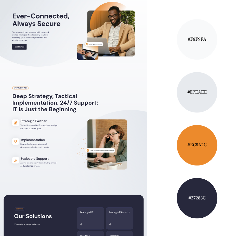
Why We Like This Color Palette:
FusionTek’s color palette is understated yet strategic in its use of orange. This quiet approach aligns with color psychology: the neutral tones invoke professionalism and clarity, while the sparing use of orange adds moments of warmth and creativity. That combination gives FusionTek a grounded, thoughtful look, bringing a sense of reliability and just enough spark to feel approachable.
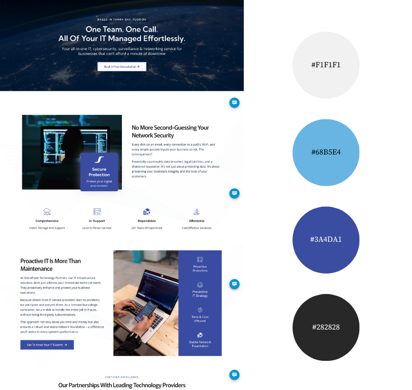
Why We Like This Color Palette:
The soft off-white background and dark gray text make the StonePoint site clean, legible, and easy to digest. Shades of blue, used mostly in graphics and the logo, add just enough color to suggest professionalism and stability without overpowering the layout.
The palette supports the content instead of competing with it. It gives the site a serious, capable tone that feels aligned with high-level consulting. Quiet confidence, well executed.

Why We Like This Color Palette:
Allwhere’s palette is warm, light, and cheerful.
The soft beige backgrounds are a fun alternative to white, while yellow accents add energy. Used in buttons, icons, and image highlights, the yellow draws attention. Paired with charcoal text, the overall look feels clear, friendly, and modern.
It’s a palette that signals tech that’s easy to use and easy to trust.
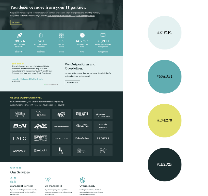
Why We Like This Color Palette:
Live Oak’s colors mirror their vibe. Warm. Reliable. Human.
The soft aqua and pale teal backgrounds create a relaxed, open feel that makes the site approachable right away. Deep greenish-blue text adds contrast and a muted yellow shows up in just the right spots, framing buttons and accents.
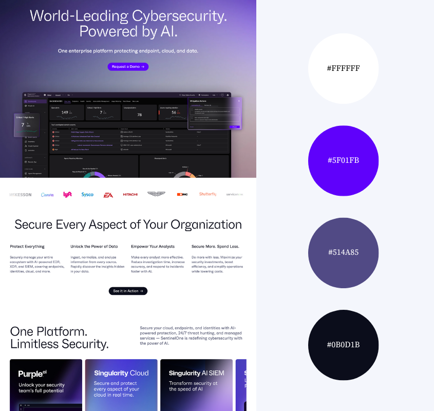
Why We Like This Color Palette:
t’s no surprise that purple is a dominant color on this website. Purple signals power and intelligence. The deep purple gradient in the hero sets a bold futuristic tone right away as a more vibrant hue accents highlight key metrics. Paired with clean black and white text and buttons, the site exudes high performance and is made for the target audience—people who take security seriously.
Smart Color Choices Build Better IT Websites
A great color palette does two big things.
Before anyone reads your tagline or clicks your pricing button, your colors tell them what kind of brand you are.
Second, it makes your site easier to use. Strategic contrast and smart accents guide the eye so people know where to look, what to read, and what to do next.
The best color palettes reinforce your message and appeal to the customers you love working with.
For more color inspiration, check out our posts on color palettes for accounting services, travel, and therapy websites.

Kristie Parker
Kristie is the co-owner of Bungalow Web Design. She pretends to be a real adult by writing copy for small business websites from her actual bungalow in Tampa, Florida. When she's not web designing, you can find her in the gym, air frying something, or tucking into a Joyce Carol Oates novel with a dirty martini and orange cat nearby.